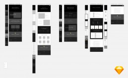
CloseCircle
After over 15 years offering travel security to the world's leading businesses and institutions, Drum Cussac asked us to launch their first consumer offering, 'CloseCircle'. The service allows the user to track account members last known locations and access country alerts and advice covering 5 categories. In the worst case scenario CloseCircle offers rescue and evacuation at no extra cost.


Building the identity
In a worst case scenario, CloseCircle's strength is in their ability to utilise real-time information and British military expertise at HQ to determine the best course of action for you to take. They deal with 5 areas of threat (terrorist, natural disasters, political, infrastructure and medical). To get this across as simply as possible we created the brands mission statement "Predictability in an unpredictable world".We defined tone of voice principles for CloseCircle to communicate them as distinguished, discerning and poised.We created a print ad displayed in lifestyle magazines such as Tatler and Condé Nast Traveller to position the brand directly in front of our target audience. To disrupt the usual "perfect" image of the ads shown in these publications we used a hurricane stricken tropical beach resort with the simple line "Paradise is knowing they are safe ".


Visual language
The visual language was important. We needed a direction that was balanced in it's weight to each risk category but at the same time didn't scare people and focus on the negative situations that the service excels at dealing with. To achieve this the visual language should hero the freedom of moving around your everyday activities, be that inner city working or taking a gap year travelling.To create the feel of being protected by the service without feeling like you are being tracked as an individual we used aerial photography that have the feeling of a piece of art. Landscapes were chosen from around the globe that look refined, elegant and luxurious.


Logo
I wanted to keep the logo simple and uncomplicated as the place where people will see it most is on the home screen of their phone. Inspiration for the logo was taken primarily from the pin you see everyday in apps and service that are location based. it was then altered to resemble the "C" from the brand name and the silhouette of a person to encompass the core elements of CloseCircle, Protection for you or your family members anywhere in the world, not matter your location.

Colour palette
As part of the new brand we developed an simple colour palette. These colours can be both expressive and subtle. The typography, illustration and the logo mark all work harmoniously together, creating a distinctive graphic language.
Colour palette
As part of the new brand we developed an simple colour palette. These colours can be both expressive and subtle. The typography, illustration and the logo mark all work harmoniously together, creating a distinctive graphic language.

Typography
The typography was inspired by brands and services use daily by our target audience. The serif typeface "Playfair display" bought the elegance and luxury style to the brand identity, while the sans serif typeface "Raleway" helped to keep a clean and crisp finish to the long format text. Both typefaces would also work well across all formats, both digital and print.